

Challenge
The global premium beverage market is one of the most contested spaces in consumer goods. Sparkling water, once a simple category, has become a visual battlefield where brands compete through increasingly loud, increasingly similar aesthetics.
The target consumer is design-literate, health-conscious, and moves between Riyadh, Singapore, and London. They have grown immune to conventional FMCG persuasion. They are drawn to brands that don’t need to try. Building for that consumer, across both physical retail and digital-first discovery, required not just a different look. It required a different philosophy entirely.
Solution
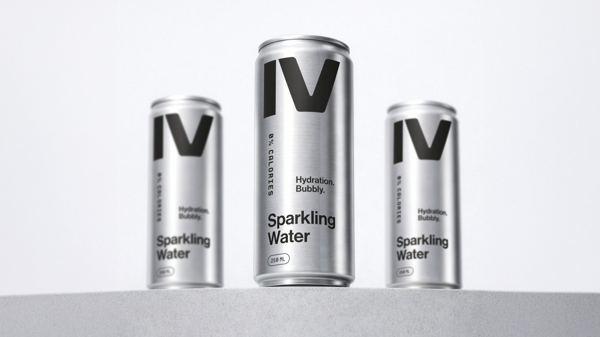
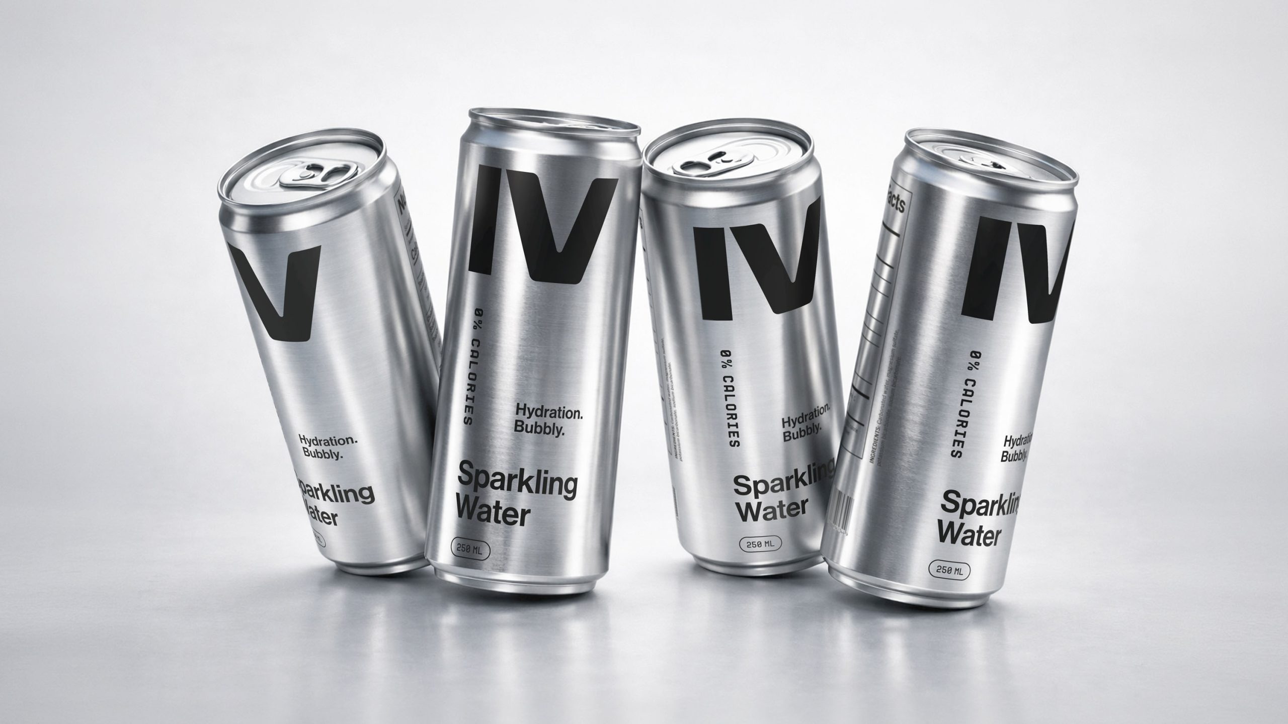
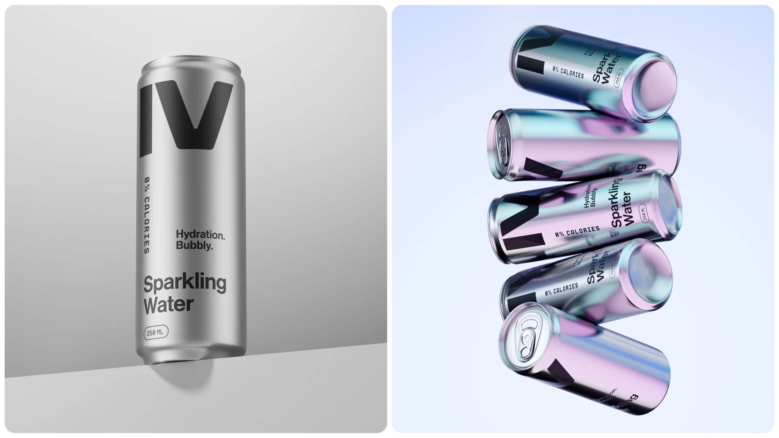
Two letters. One material. No compromises.
The IV mark was scaled to dominate, treated not as a logotype but as a visual monument, rendered in pure black directly onto uncoated aluminium. No label. No shrink wrap. Nothing between the brand and the consumer but the product itself. Every typographic decision, every word on the can, earns its place through function alone.
The result is a brand that competes not by shouting, but by having nothing to prove. In premium markets, that is the strongest position a product can occupy.
Developed as a complete brand and packaging system for premium retail positioning across regional and international markets.


